📊 How to Calculate YOY, QOQ, MOM, YTD, QTD and MTD in Python Using Pandas
PANDAS
Kishore Babu Valluri
5/13/20256 min read

In the world of data analytics, especially financial and business reporting, metrics like YOY (Year Over Year), QOQ (Quarter Over Quarter), MOM (Month Over Month), YTD (Year to Date), Quarter to Date (QTD) and MTD (Month to Date) are commonly used to evaluate performance over time.
In this post, we'll break down what each term means and show you how to calculate them using Python and Pandas.
🧠 What Do These Terms Mean?
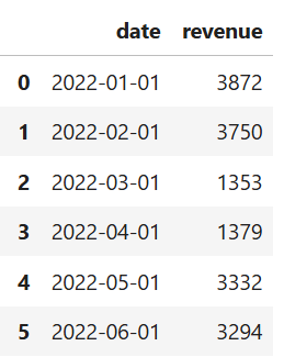
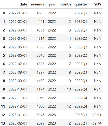
🧪 Sample Dataset
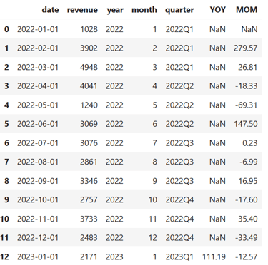
Let’s create a simple dataset of monthly revenue:
import pandas as pd
import numpy as np
import matplotlib.pyplot as plt
import seaborn as sns
date_range = pd.date_range(start='2022-01-01', end='2025-05-01', freq='MS')
df = pd.DataFrame({
'date': date_range,
'revenue': np.random.randint(1000, 5000, len(date_range))
})

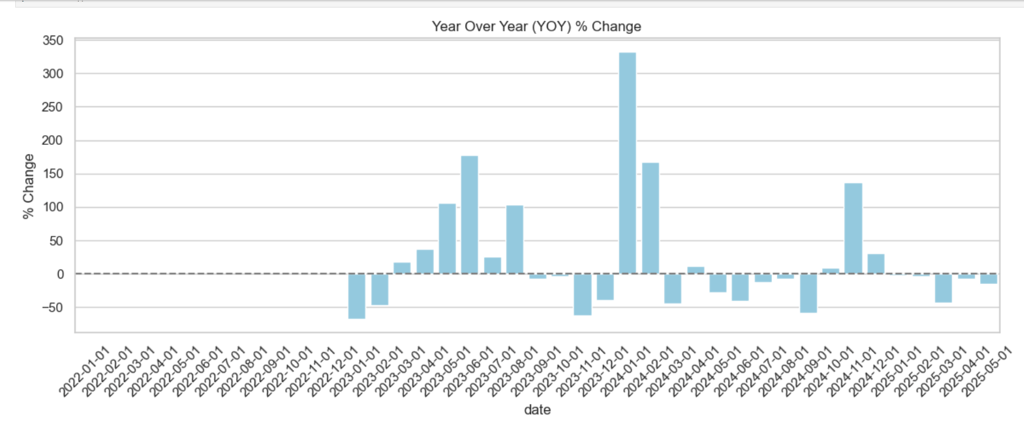
📈 Calculating YOY (Year Over Year)
To calculate YOY, we compare each month's revenue to the same month in the previous year.
This gives the percent change from the same month last year.
df['YOY'] = df['revenue'].pct_change(periods=12) * 100
df['YOY']=df['YOY'].apply(lambda x:np.round(x,2))
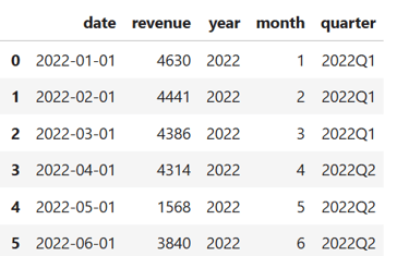
# Time features
df['year'] = df['date'].dt.year
df['month'] = df['date'].dt.month
df['quarter'] = df['date'].dt.to_period('Q')
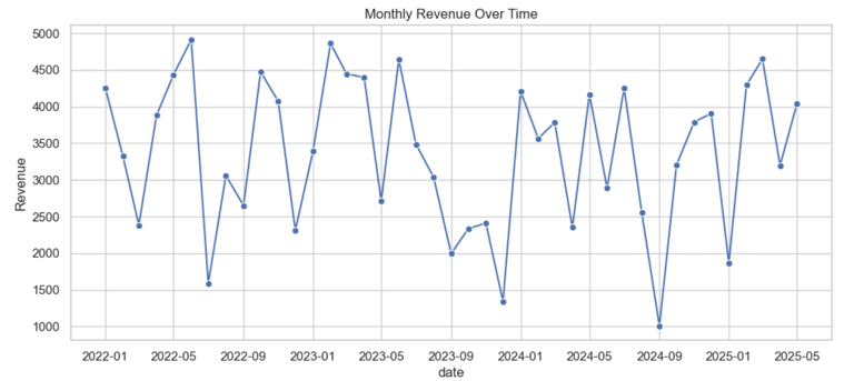
📈 Revenue Over Time
plt.figure()
sns.lineplot(data=df, x='date', y='revenue', marker='o')
plt.title('Monthly Revenue Over Time')
plt.ylabel('Revenue')
plt.show()

📆 Calculating MOM (Month Over Month)
This gives the percent change from the previous month.
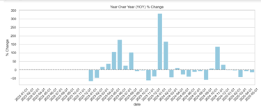
📊 YOY Percentage Change
plt.figure(figsize=(12, 5))
sns.barplot(data=df, x='date', y='YOY', color='skyblue')
plt.title('Year Over Year (YOY) % Change')
plt.xticks(rotation=45)
plt.axhline(0, color='gray', linestyle='--')
plt.ylabel('% Change')
plt.tight_layout()
plt.show()
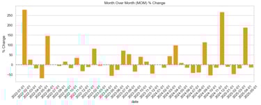
# MOM: Month Over Month % Change
df['MOM'] = df['revenue'].pct_change(periods=1) * 100
df['MOM']=df['MOM'].apply(lambda x:np.round(x,2))
📉 MOM Percentage Change
plt.figure(figsize=(12, 5))
sns.barplot(data=df, x='date', y='MOM', color='orange')
plt.title('Month Over Month (MOM) % Change')
plt.xticks(rotation=45)
plt.axhline(0, color='gray', linestyle='--')
plt.ylabel('% Change')
plt.tight_layout()
plt.show()

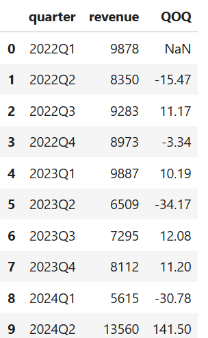
📈 Calculate QOQ (Quarter over Quarter % Change)
This gives the percent change from the previous Quarter.
quarterly_df = df.groupby('quarter').agg({'revenue': 'sum'}).reset_index()
quarterly_df['QOQ'] = quarterly_df['revenue'].pct_change() * 100
quarterly_df['QOQ']=quarterly_df['QOQ'].apply(lambda x:np.round(x,2))

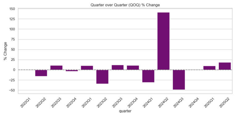
📉 QOQ Plot (Quarterly % Change)
plt.figure(figsize=(10, 5))
sns.barplot(data=quarterly_df, x='quarter', y='QOQ', color='purple')
plt.title('Quarter over Quarter (QOQ) % Change')
plt.axhline(0, color='gray', linestyle='--')
plt.xticks(rotation=45)
plt.ylabel('% Change')
plt.tight_layout()
plt.show()
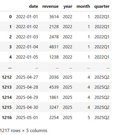
🧪 Sample Dataset
Let’s create a simple dataset of daily revenue:
import pandas as pd
import numpy as np
import matplotlib.pyplot as plt
import seaborn as sns
# Generate a sample date range
date_range = pd.date_range(start='2022-01-01', end='2025-05-01', freq='D')
# Create a DataFrame
df = pd.DataFrame({
'date': date_range,
'revenue': np.random.randint(1000, 5000, len(date_range))
})
df['year'] = df['date'].dt.year
df['month'] = df['date'].dt.month
df['quarter'] = df['date'].dt.to_period('Q')

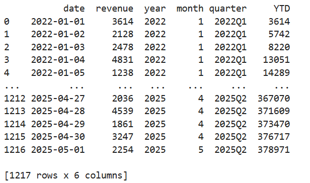
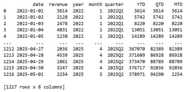
📅 Calculating YTD (Year to Date)
Aggregates values from the beginning of the year up to a specified date. This will reset every January and give a running total of revenue within each year.
df['YTD'] = df.groupby(df['date'].dt.year)['revenue'].cumsum()
df['YTD']=df['YTD'].apply(lambda x:np.round(x,2))
print(df)
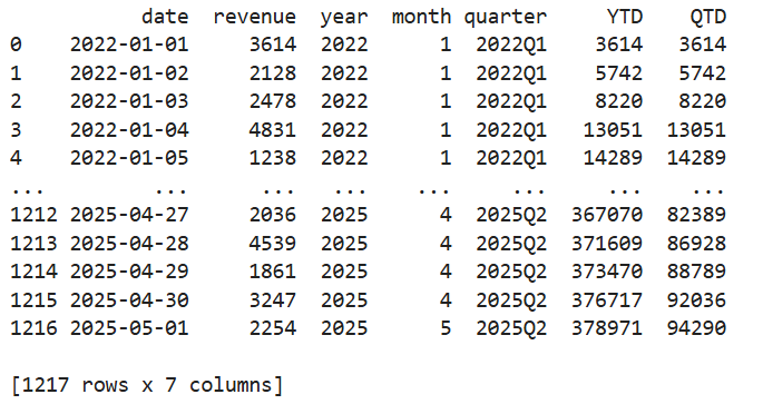
📊 Calculate QTD (Quarter to Date)
Cumulative value from the start of the quarter to the current date. This works just like YTD, but resets every quarter.
df['QTD'] = df.groupby(df['quarter'])['revenue'].cumsum()
print(df)
📅 Calculating MTD (Month to Date)
Aggregates values from the beginning of the month up to a specified date.
df['MTD'] = df.groupby([df['date'].dt.year, df['date'].dt.month])['revenue'].cumsum()
ptint(df)
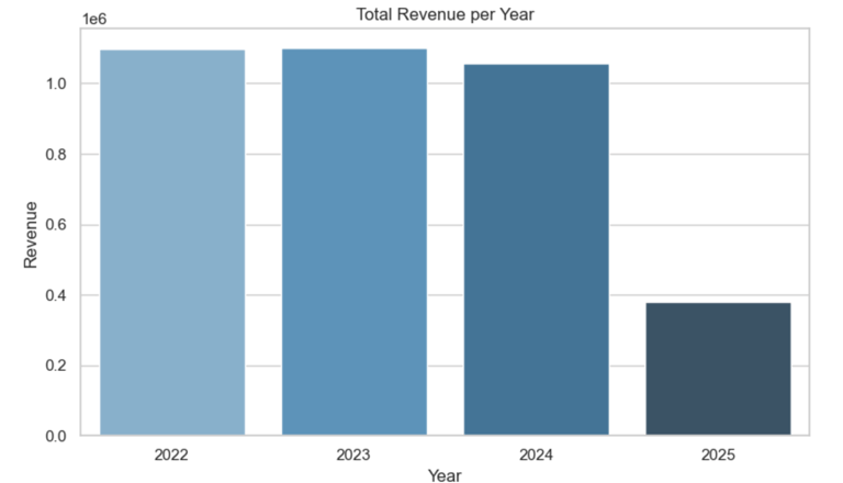
Visualize Total Revenue
Year-wise total revenue
Quarter-wise total revenue
Month-wise total revenue (aggregated across all years)
These give a clean, high-level summary of how your revenue behaves over different time periods.
📌 1. Year-wise Revenue (Total per Year)
yearly_rev = df.groupby('year')['revenue'].sum().reset_index()
plt.figure(figsize=(8, 5))
sns.barplot(data=yearly_rev, x='year', y='revenue', palette='Blues_d')
plt.title('Total Revenue per Year')
plt.ylabel('Revenue')
plt.xlabel('Year')
plt.tight_layout()
plt.show()
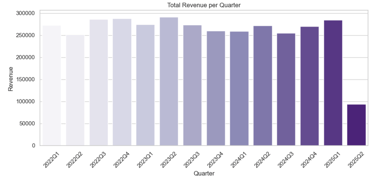
📌 2. Quarter-wise Revenue (All Quarters Across Years)
# Convert 'quarter' to string for better x-axis labels
df['quarter_str'] = df['quarter'].astype(str)
quarterly_rev = df.groupby('quarter_str')['revenue'].sum().reset_index()
plt.figure(figsize=(10, 5))
sns.barplot(data=quarterly_rev, x='quarter_str', y='revenue', palette='Purples')
plt.title('Total Revenue per Quarter')
plt.ylabel('Revenue')
plt.xlabel('Quarter')
plt.xticks(rotation=45)
plt.tight_layout()
plt.show()

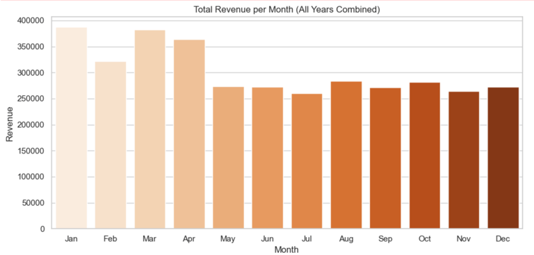
📌 3. Month-wise Revenue (Across All Years Combined)
# Aggregate by month number across all years
month_labels = ['Jan', 'Feb', 'Mar', 'Apr', 'May', 'Jun',
'Jul', 'Aug', 'Sep', 'Oct', 'Nov', 'Dec']
monthly_rev = df.groupby('month')['revenue'].sum().reset_index()
monthly_rev['month_name'] = monthly_rev['month'].apply(lambda x: month_labels[x - 1])
plt.figure(figsize=(10, 5))
sns.barplot(data=monthly_rev, x='month_name', y='revenue', palette='Oranges')
plt.title('Total Revenue per Month (All Years Combined)')
plt.ylabel('Revenue')
plt.xlabel('Month')
plt.tight_layout()
plt.show()

✅ Key Takeaways
📌 1. Understand Essential Time-Based Metrics
YOY (Year over Year) shows long-term annual growth by comparing a month’s value to the same month last year.
MOM (Month over Month) tracks short-term performance by comparing the current month to the previous one.
YTD (Year to Date) aggregates cumulative performance from January to the current date.
MTD (Month to Date) captures partial month performance up to the current day.
QOQ (Quarter over Quarter) compares the current quarter’s performance to the previous one — useful for quarterly reporting.
QTD (Quarter to Date) aggregates progress made during the current quarter so far.
🐍 2. Leverage Python and Pandas for Quick Calculation
Metrics like YOY, MOM, QOQ can be computed using pct_change().
Cumulative metrics like YTD, MTD, and QTD are easily handled with groupby().cumsum().
Pandas makes it easy to slice and summarize time-based data by year, quarter, or month.
📊 3. Visualization is Crucial
Line plots are excellent for showing trends over time (e.g. YTD, QTD).
Bar charts are ideal for comparing aggregated values by period (e.g. total revenue per year, quarter, or month).
Annotated charts make the story clearer to stakeholders and non-technical audiences.
📅 4. Seasonal and Trend Analysis Made Simple
With month-wise and quarter-wise aggregations, you can identify seasonality (e.g. recurring spikes in Q4 or dips in summer).
Year-wise and QOQ plots help track growth, decline, or plateaus across time.
🧠 5. Reusability and Scalability
Once the logic is in place, this framework can be reused for any KPI — not just revenue (e.g. users, sales, expenses).
It scales to daily, weekly, or financial calendars with slight tweaks.

Kishore Babu Valluri
Senior Data Scientist | Freelance Consultant | AI/ML & GenAI Expert
With deep expertise in machine learning, artificial intelligence, and Generative AI, I work as a Senior Data Scientist, freelance consultant, and AI agent developer. I help businesses unlock value through intelligent automation, predictive modeling, and cutting-edge AI solutions.
Let's Get in Touch
marketing@deepaiautomation.com
+91 6309397994
© 2025. All rights reserved.
Industries
Manufacturing
Financial Services
Retail
Solutions
DocuMind AI - Intelligent Document Migration
InsightEdge AI - Intelligent Power BI Reporting & Analytics
DCT AI - Digital Control Tower for Intelligent Enterprise Visibility
Inventra AI - Intelligent Inventory Optimization Platform
Maintenix AI - Predictive Maintenance Intelligence Platform
PayPredict AI - Intelligent Customer Payment Prediction Platform
SegMind AI - Intelligent Customer Segmentation & RFM Analytics Platform
DataForge AI - Intelligent ETL & Analytics Modernization Platform
DataSense AI - Intelligent Data Quality & Outlier Detection Agent